Crafting a seamless onboarding experience
Libro Credit Union - Online Banking
End to End Product Design . Design System . Brand Identity . Design Strategy
Libro’s onboarding experience is a critical first touchpoint for new Owners joining the credit union. As the sole UX designer on the project, I was responsible for redesigning the onboarding journey.
Methods:
Market research, user interviews, current journey analysis, ideation, icon and component design, wireframing and prototyping, usability testing
My Role:
UX Designer and Researcher
Goal:
The project aimed to revamp the onboarding experience for Libro Owners (users) to create a more inclusive, consistent, and user-friendly experience that aligns with Libro’s values and reinforces its commitment to Owner-first banking.
Duration:
3 months (6 sprints)
Team:
Cross-functional agile team - 3 developers, a BA, a QA, a product owner, a scrum master, and a UX designer (me)
Tools:
Figma, Miro, DevOps, Lyssna
A Look Into the Data
RESEARCH
Market Research Findings
Research into customer expectations and current digital banking trends uncovered essential insights to guide improvements in Libro’s onboarding experience.
🙋♀️ Customer Expectations
-
72% of users prefer setting up security credentials first, building early trust.
-
Users are 45% more likely to abandon tasks when faced with long, scroll-heavy pages. Breaking content into sections with clear navigation improves engagement.
-
57% of users abandon onboarding if it takes longer than 10 minutes, highlighting the need for a streamlined process.
-
Progress indicators and tooltips reduce friction and keep users engaged.
-
68% of banking users prefer in-context help features over FAQs or external guides.
🖥️ Digital Banking Trend
-
75% of users access accounts on both desktop and mobile, with 60% expecting identical. workflows.
-
RBC, Scotiabank, and fintech challengers like Tangerine and WealthSimple use AI for guidance, personalization, and self-serve options.
-
Features like account recommendations, guided setup tours, and interactive tutorials enhance the experience.
Current User Journey
Taking a closer look at the existing Libro online banking onboarding experience to gain a clearer understanding of the core issues.
Workflow
Mapping the user flow of the onboarding experience for a clear visual of the current process, helping identify inefficiencies and informing future enhancement opportunities.

🧐 Heuristic Evaluation
A heuristic evaluation identified 20 critical barriers in the existing onboarding flow, highlighting areas where the experience failed to meet inclusive design standards.
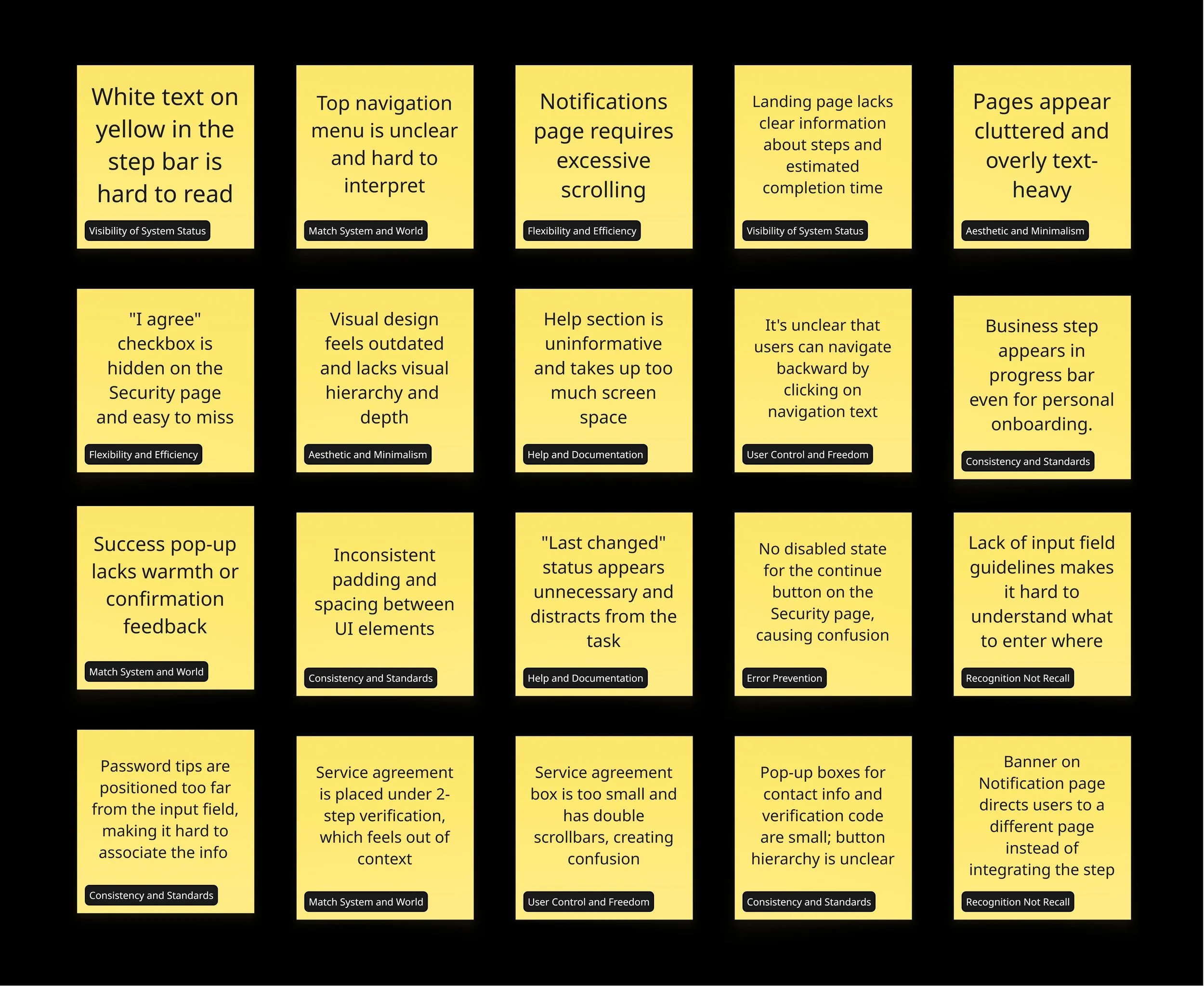
🚩 Pain Points from the User Interviews
I conducted 10 user interviews, and the key pain points identified closely aligned with the issues uncovered in the heuristic evaluation.
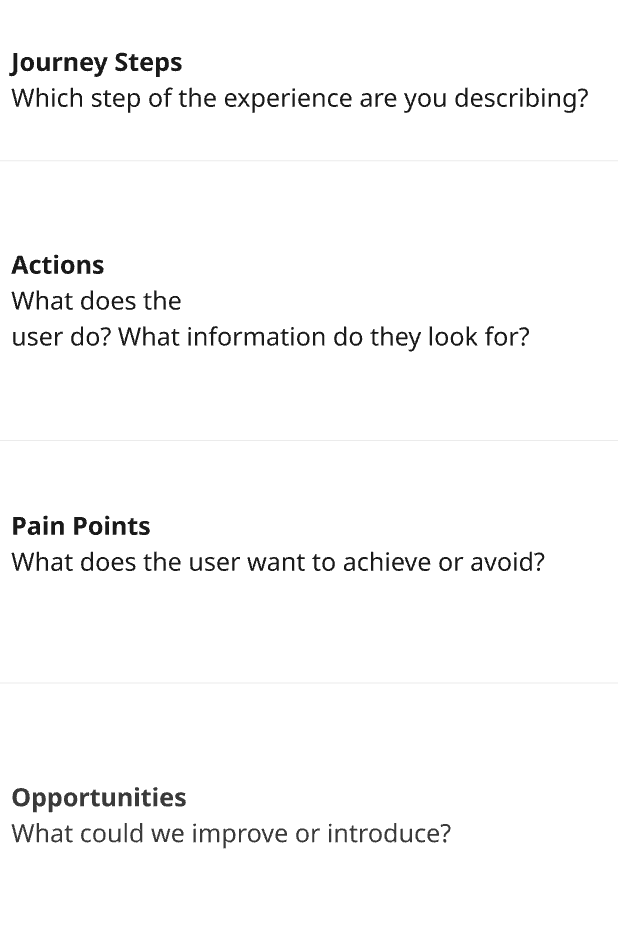
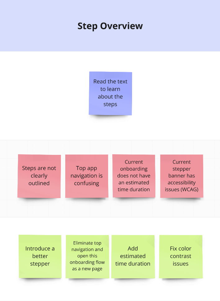
The research findings were synthesized into a journey map that clearly highlights steps, user actions, key pain points, and opportunities for improvement.
Journey Map

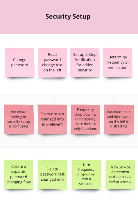


Sticky Notes to Solutions
IDEATION
💡 Ideation Sessions
I led a series of ideation sessions to explore solutions for enhancing the onboarding experience. The goal was to generate a wide range of ideas from grounded improvements to bold, future-thinking concepts.
I structured the ideation process into four targeted sessions to gather diverse perspectives across the organization.
🎯 Session 1: Onboarding Team
"Fix the Friction"
Focus: Identify improvements to the step-by-step flow and content clarity.
Participants: Coaches and staff involved in onboarding new Owners.
Activity: Crazy 8s and “How Might We” prompts based on pain points from the journey map.

👥 Session 3: Stakeholders
"Business Goals & Owner Impact"
Focus: Align onboarding with business priorities while improving Owner satisfaction.
Participants: Product owners, compliance, marketing, and business banking leads.
Activity: Impact/Effort Matrix based on business metrics and Owner outcomes.
🙋♀️ Session 4: Solo Ideation
"Stretch the Boundaries"
Focus: Explore bold or unconventional ideas unconstrained by current platform or policies.
Activity: Lightning Demos from competitor apps followed by 15-minute sketch storm.
💻 Session 2: Digital Team
"Consistency & Scalability"
Focus: Ensure visual and functional consistency across devices and platforms.
Participants: Developers, QA, and product managers from the Digital team.
Activity: Brainwriting and flowchart critique with post-its based on mobile/desktop friction.


💬 Outcomes
These sessions provided a rich set of ideas that were voted on based (marked with circles) on feasibility, impact, and alignment with project goals. Several of the low-to-mid effort ideas such as restructured step indicators, contextual help, and mobile-optimized layouts were incorporated into the final onboarding design.
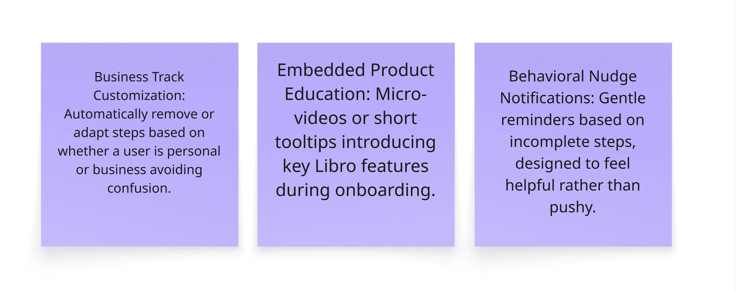
The bolder concepts helped shape a long-term vision for future enhancement projects.
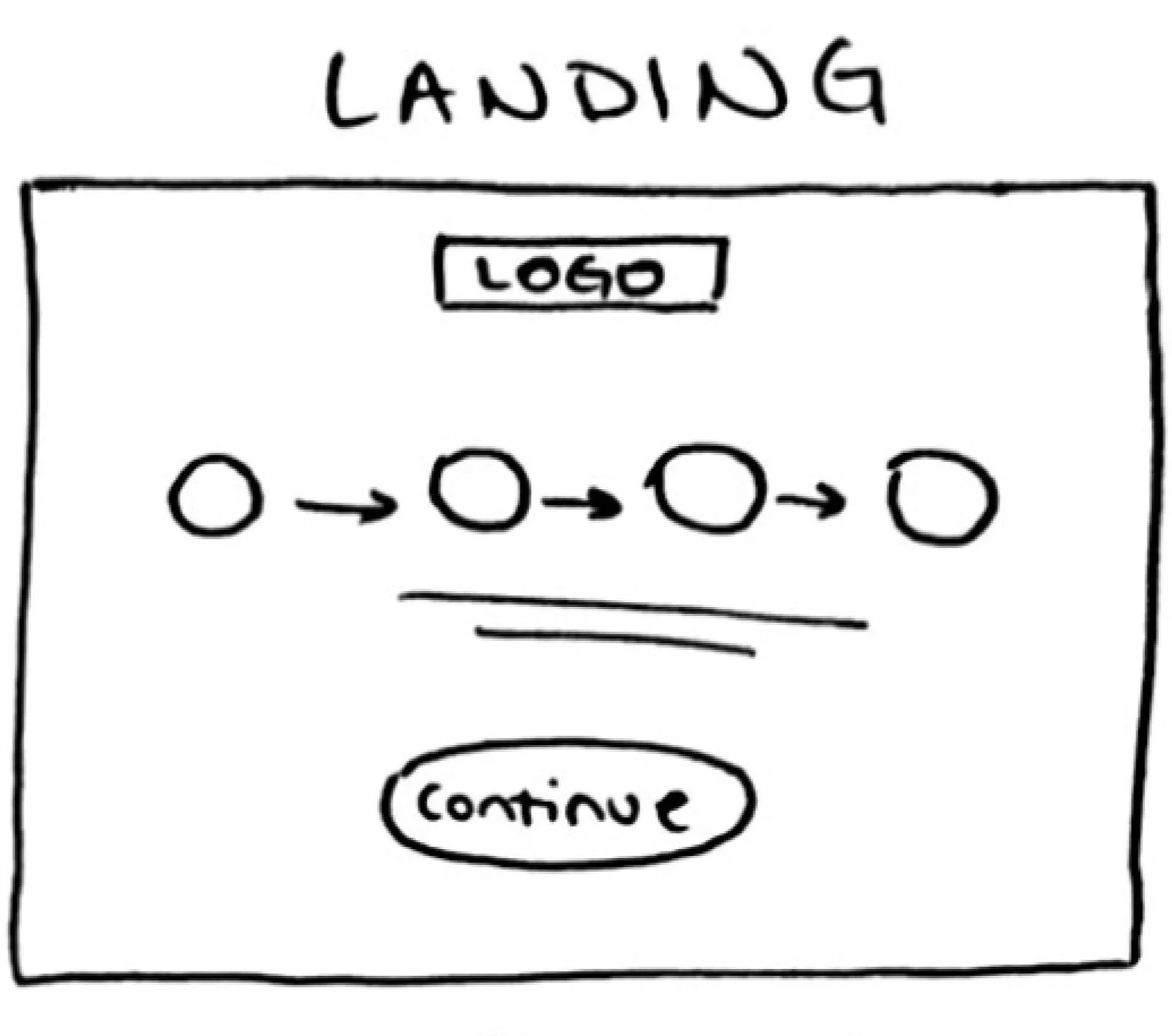
🖊️ Visualizing the ideas
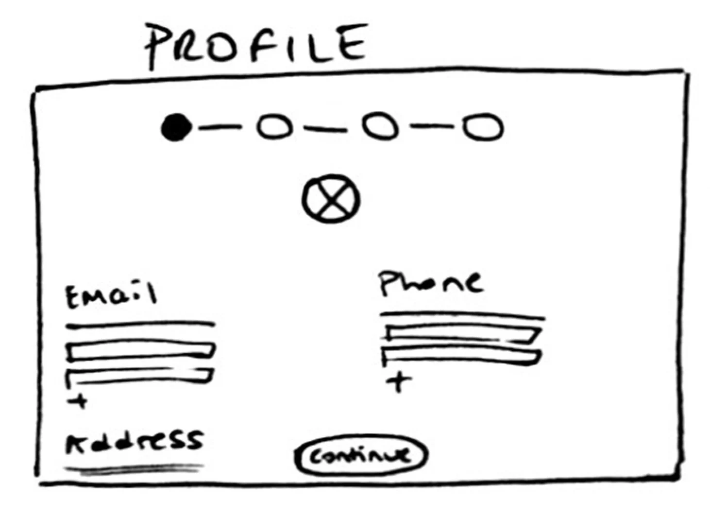
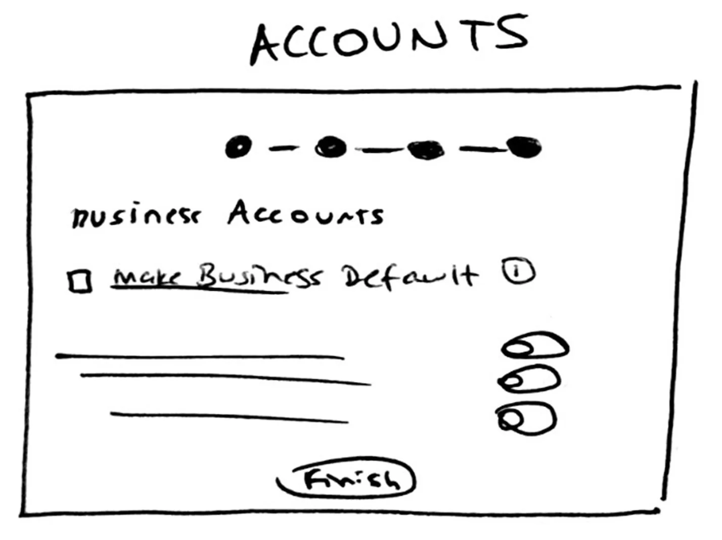
I began by creating low-fidelity sketches to quickly visualize early concepts. I like working in low fidelity because it allows rapid iteration without getting caught up in visual details, enabling focus on structure and user flow before committing to final UI elements.


✔️ Service Agreement in the beginning to improve logical flow
✔️ Two-step acceptance (checkbox + button) to reduce unintentional consent
✔️ Big pop-up window to improve readability and ensure accessibility
✔️ Opacity in the stepper to indicate pending steps
✔️ Profile image edit option to support easy personalization
✔️ Email and phone fields placed side by side to improve layout efficiency
✔️Address disclaimer banner to increase compliance clarity

✔️ Help icon to provide quick, accessible support
✔️ Pop-up alignment to improve readability of contact method modals
✔️ Disabled button to prevent user confusion when actions are incomplete

✔️ Tabs to divide complex information into digestible sections
✔️ Collapsible drawer for accounts to reduce clutter
✔️ "Same for all accounts" checkbox to reduce repetitive input
✔️Sticky continue button to improve task flow
✔️ Split-screen design to enhance branding visibility and improve layout balance
✔️ Progressive disclosure for entering Owner number and password to simplify the UX
✔️ A prominent Libro branch image on the left to reinforce brand identity
✔️ Service Agreement in the beginning to improve logical flow
✔️ Two-step acceptance (checkbox + button) to reduce unintentional consent
✔️ Big pop-up window to improve readability and ensure accessibility

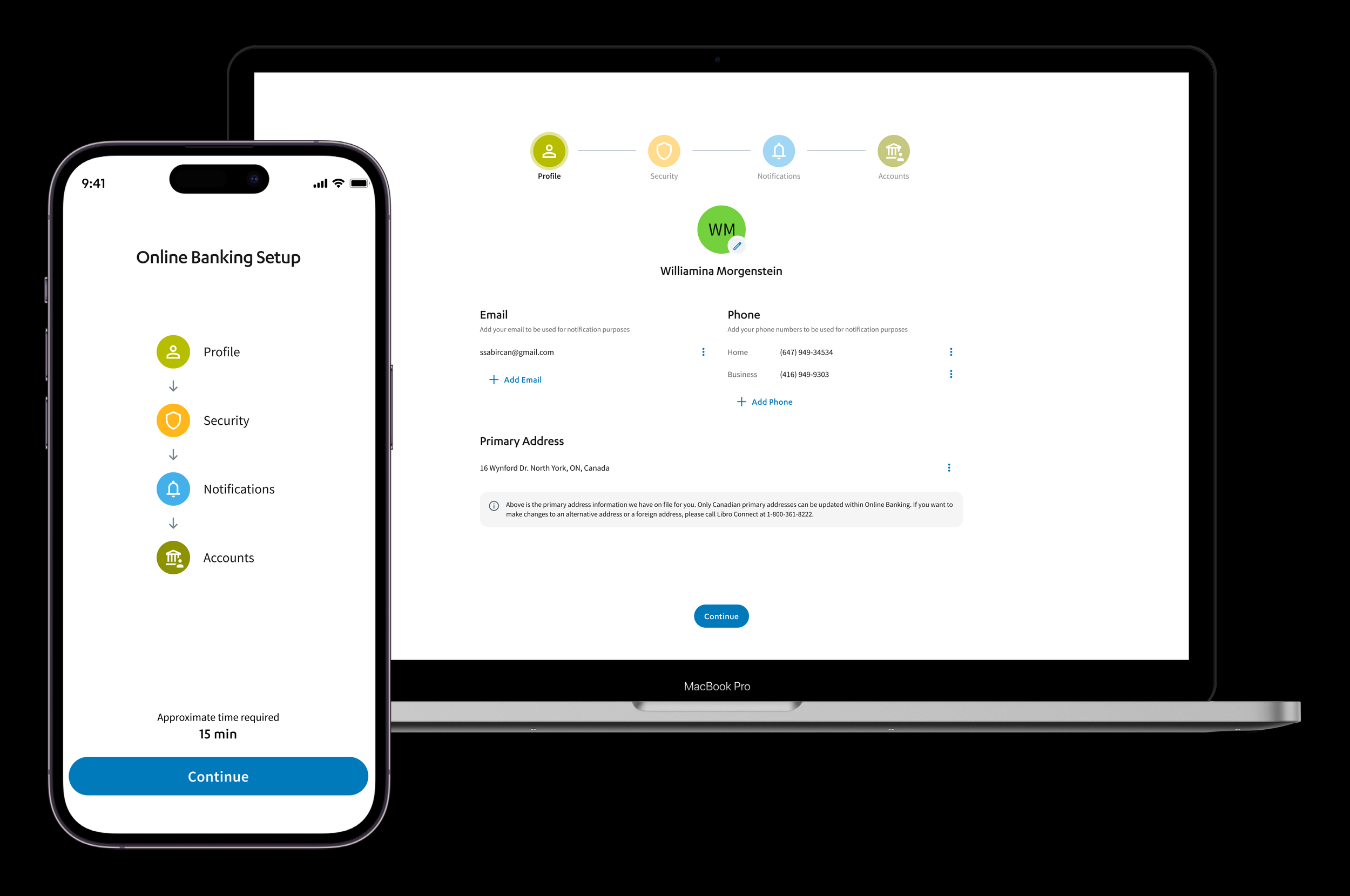
✔️ "Accounts" in the stepper to make the label more inclusive and intuitive
✔️ Visual stepper with icons to Improves scannability and user orientation
✔️ Center-aligned page to create better visual balance and hierarchy
✔️ Estimated time text to help manage user expectations
✔️ Opacity in the stepper to indicate pending steps
✔️ Profile image edit option to support easy personalization
✔️ Email and phone fields placed side by side to improve layout efficiency
✔️Address disclaimer banner to increase compliance clarity
Final Product
If you're having trouble viewing the embedded prototype, use the buttons below to access the high-fidelity Desktop and Mobile versions, along with any portfolio visuals referenced in this case study. A demo video of the final product is also available for a complete walkthrough.
Desktop Prototype
Putting It to the Test
Participants:
Internal Libro staff and selected Owners familiar with digital banking
Number of Tests Conducted:
3 rounds of usability testing
Total Iterations:
4 design iterations
6 development iterations
Tool Used:
Lyssna (formerly UsabilityHub)
Test Types:
Visual preference tests, click tests, and comprehension-based question prompts
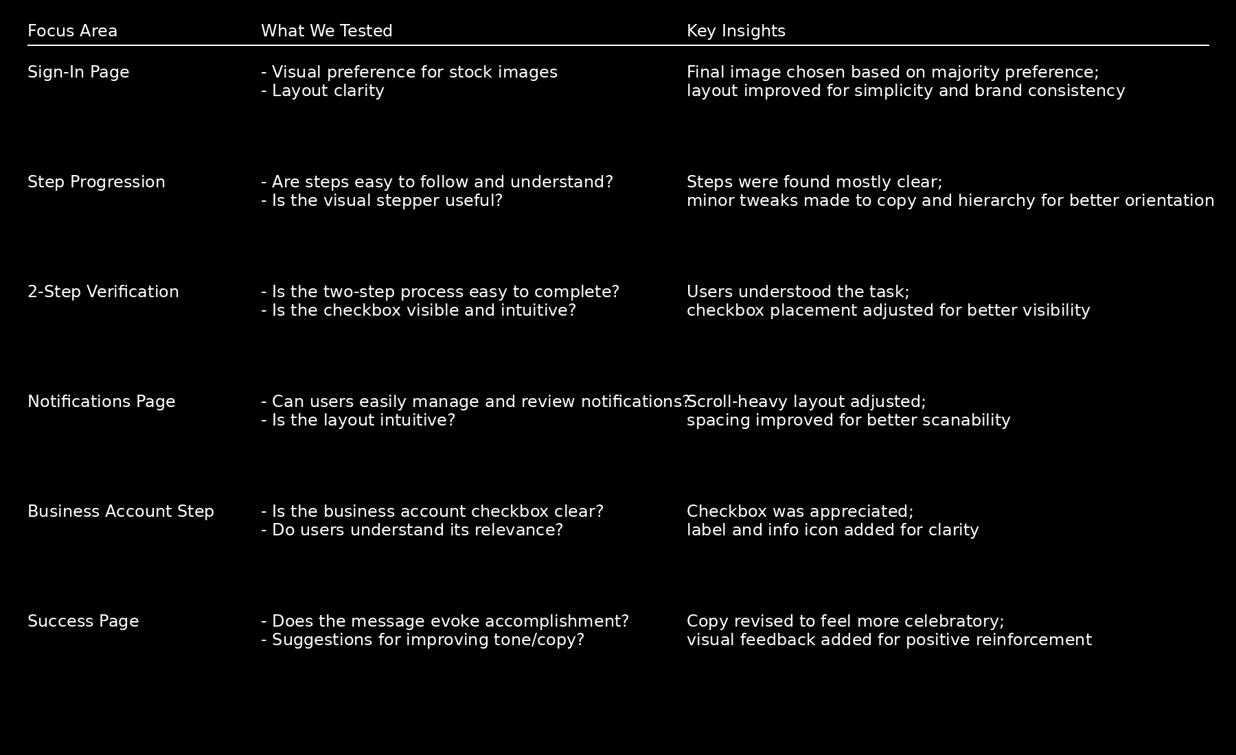
Results Overview
😊 Satisfaction rate increased to 92%
⏱️ Average session length decreased to 7 minutes
✅ Completion rate increased to 86%
📞 In 2025, Libro Connect received only 20 calls related to online onboarding, All were related to temporary password resets.
Fidelity Tested:
Low to high-fidelity wireframes


