Improving the Accounts Page
Libro Credit Union - Online Banking
UI/UX Design . UX Research. Design Strategy
Improved the information architecture and UI of the Accounts page to simplify account access and enhance the experience of switching between personal and business accounts, enabling Owners to manage their information efficiently. Also designed a responsive tablet view to support seamless access across devices.

Methods:
Current user journey investigation, feedback reviews, heuristic evaluation, bug reports, affinity mapping, ideation, wireframing, prototyping, video creation, usability testing
My Role:
UX Designer and Researcher
Goal:
Rooted in AODA compliance, the project aimed to enhance key banking tasks—such as viewing accounts, switching between personal and business views, and opening new accounts while improving clarity in system notifications and messaging.
The redesign also focused on delivering a consistent experience across devices by introducing a dedicated tablet view and boosting scannability through improved visual hierarchy, clear language, and contextual infotips.
Duration:
12 months (24 sprints)
Team:
Cross-functional agile team - 7 developers, 2 BAs, a QA, a product owner, a scrum master, and 3 UX designer (me)
Tools:
Figma, Miro, Jira, Qualtrics, 11:FS, Maze,
Understanding The Why
DEFINE
Mapping Assumptions and Claims
Every great design starts with clarity. Before diving into solutions, I focus on understanding the problem the team is trying to solve.
🔧 Why enhance our digital experience?
Our Online Banking user experience impacts majority of our Owners and how they bank with us.
Through market assessments in our target areas in the past, we discovered that having convenient and user-friendly banking services is among the top 5 things people look for in their financial institution.


💭 Assumptions and Claims
The Online Banking interface feels outdated due to minimal visual updates over the past five years.
Maintenance and iterative improvements of Online Banking have not been prioritized.
User feedback collected in recent years has not been translated into product enhancements.
The current Mobile Banking experience does not meet evolving Owner expectations or design standards.
There is currently no dedicated app or optimized experience for tablet users.
Inconsistent performance and design across devices frustrates Owners.
INSIGHTS NOT ASSUMPTIONS
RESEARCH
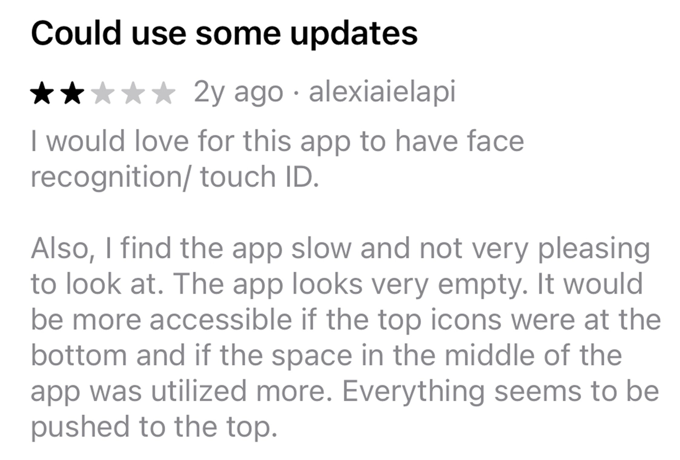
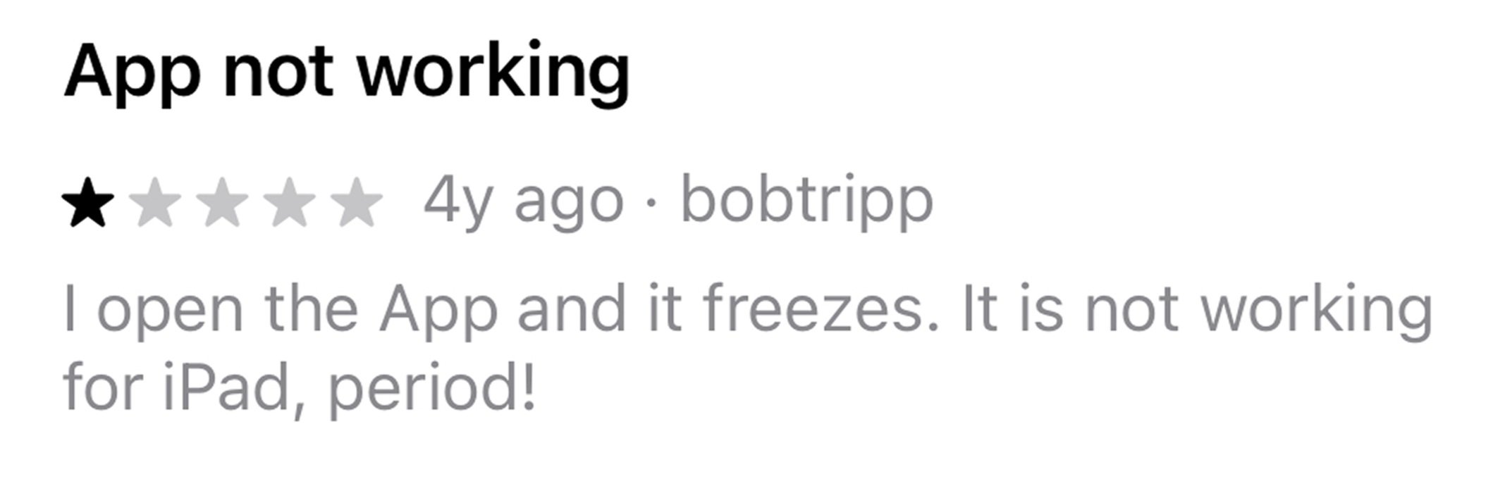
📋 Feedback Reviews
Through an analysis of negative app store reviews, I identified two recurring themes:
challenges with the tablet experience and perceptions that the app feels outdated and due for an upgrade.
Below are some standout remarks that capture these sentiments:


I also conducted an in-depth analysis of Qualtrics feedback collected over the past four years to uncover long-standing user pain points and patterns.
I also conducted an in-depth analysis of Qualtrics feedback collected over the past four years to uncover long-standing user pain points and patterns.
⚙️ Unclear Settings Icon
Several Owners shared that they didn’t realize the Settings icon in the top-left corner was interactive, suggesting a lack of visual affordance and discoverability.
🎨 Low Caption Contrast
Owners pointed out that caption text often lacks sufficient color contrast, making it difficult to read, particularly for those with visual impairments or in bright environments.

4 key findings
🔍 Lack of Transaction Search
Owners frequently expressed frustration about not being able to search for specific transactions within individual account pages, especially when trying to locate older or high-volume activity.
📱 Confusing Mobile Navigation
Mobile users noted that the current navigation does not align with standard mobile app conventions. The top-heavy design takes up too much space and causes confusion when navigating between sections.


🧐 Heuristic Evaluation
A heuristic evaluation uncovered 11 critical usability barriers across the Accounts page, navigation pop-up, navigation bar, and individual account pages, revealing key areas where the experience fell short of inclusive design standards.


📊 Market Research
Conducted an extensive market research to gather UI and UX insights across leading financial institutions.
Timeline: 2 Sprints (4 weeks)
Tools: 11:FS Pulse, Google, Financial Institution websites
📱 25 Mobile Apps and 💻 16 Desktop Platforms were analyzed
💡 Desktop specific - All financial institutions featured a well-designed navigation menu (either at the top or side)
💡 Mobile specific - 24/25 apps use bottom navigation with 3–5 key elements
💡 11/25 apps have an “Open Account” feature within the Accounts page
💡 Card-style layouts are widely used to separate account types
💡 8 financial institutions use a carousel banner at the top for notifications or product highlights
💡 All transaction histories include a filter or search bar
💡 Collapsible elements are common to reduce scrolling
🧩 Affinity Map
The research insights were synthesized into an affinity map to uncover recurring patterns and guide design decisions. Color-coded sticky notes represent different sources: pink for negative app reviews, blue for Qualtrics feedback, green for heuristic evaluations, and yellow for market research.

Sticky Notes to Solutions
IDEATION
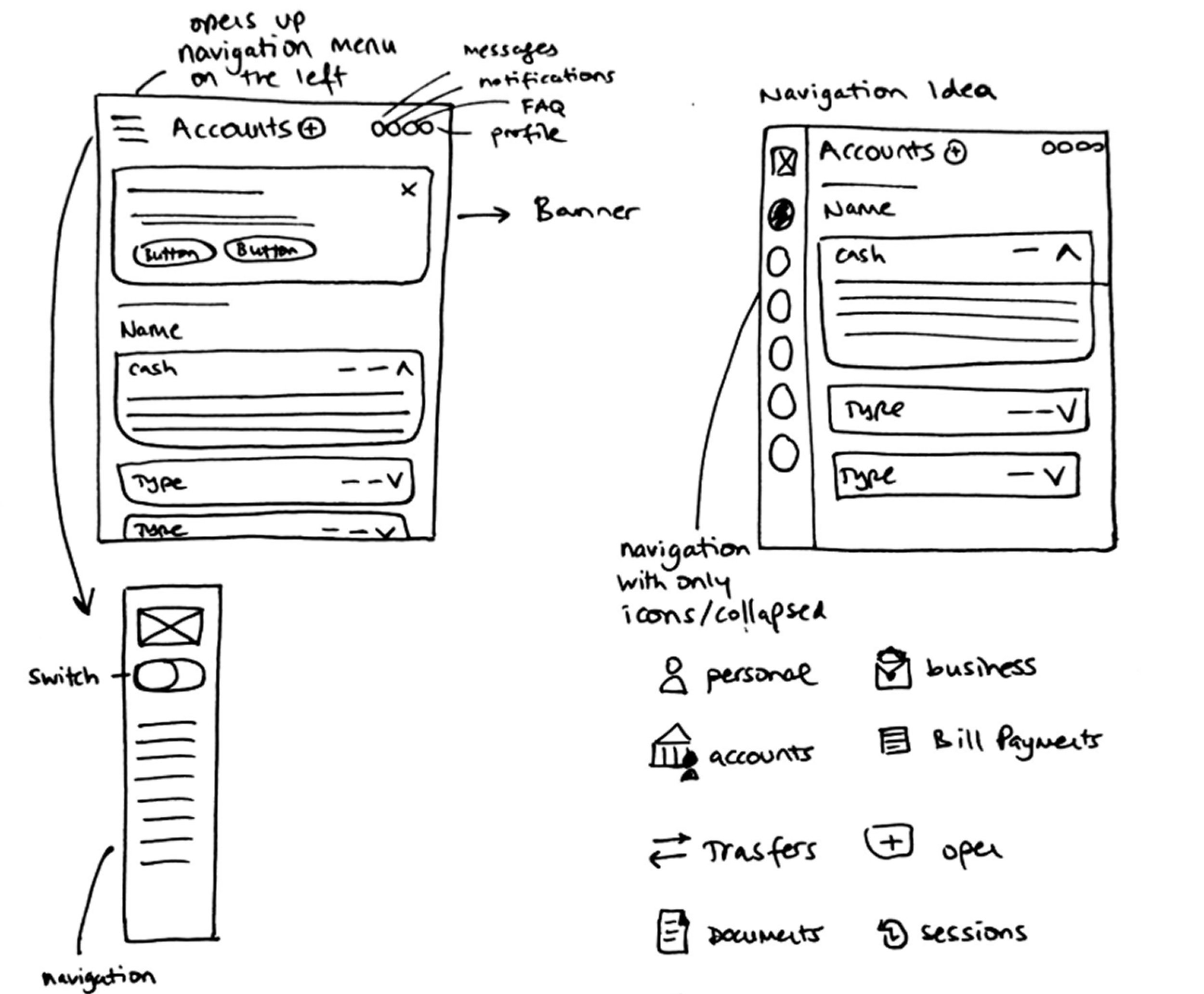
🖊️ Initial Sketches
Desktop - Accounts Page

Mobile - Accounts Page
🖥️ Medium Fidelity Wireframes
Accounts Page - Personal
Before moving into high-fidelity wireframing, I spent 2 sprints developing preliminary sketches and medium-fidelity designs to explore color and layout.

Checking Account Page - Personal

Accounts Page - Business


Tablet - Accounts Page
A Look Into the New Features
⭐ Collapsible Cards: Easily expand or collapse account details for a cleaner, more focused view.


⭐ Transaction Search & Filter: Quickly find transactions with powerful search and filter tools.
⭐ Refreshed Banners: Sleek, modern banner design for a more polished visual experience.

⭐ Business/Personal Toggle: Instantly switch between business and personal accounts.
⭐ Improved Navigation: Seamless navigation across mobile, tablet, and desktop devices.
⭐ Optimized Tablet View: Tailored layout for the best experience on tablet devices.
I collaborated with the marketing department to create the preliminary video below, which highlights what's new in our Online Banking. It's intended to keep Staff and Owners informed about the upcoming updates.


⭐ Open Accounts:
⭐ Detailed Collapsible Summary Card:

⭐ Better Mobile Layout:

Final Product
If you're experiencing technical issues viewing the embedded prototype, please use the buttons below to access both the Desktop, Mobile, and Tablet high-fidelity prototypes, as well as any visuals referenced in the case study.
Desktop Prototype
Putting It to the Test
Participants:
Internal Libro staff and and selected Owners familiar with digital banking
📊 Overall Experience ( 5,882 respondents )
Average experience score: 88.6%
88% of Owners said Online Banking was easy to use
Common Themes
✅ Intuitive and user-friendly interface
✅ Reliable and consistent performance
✅ Convenient and accessible anytime, anywhere
Verbatim Quotes
“Everything is easy to navigate and straightforward. Simplified and not too technical.”
“Just love the convenience of Online Banking. Great experience! Thank you.”
“The new modern design featuring Libro’s colors is stunning. It’s now on par with the big banks. Impressive work!”
Number of Tests Conducted:
1 round usability testing
3 month available in app feedback
Tool Used:
Userlytics and Figma
Online Banking App
Results Overview
Test Types:
Click tests, and comprehension-based question prompts
Fidelity Tested:
High-fidelity wireframe


