Transforming Libro.ca Through Storytelling
Libro Credit Union - Website
UX/UI Design · Design Systems · Brand Storytelling · Strategic Design · Web Accessibility · Collaboration
A homepage redesign rooted in purpose, strategy and emotional connection. Transforming Libro.ca into a storytelling-driven experience that showcases our brand’s 'why' and deepens engagement with current and future users.

Methods:
Stakeholder workshops, user interviews, personas, ideation, team feedback sessions, UX writing, typography, information architecture, component creation, wireframing, prototyping
Duration:
6 months (12 sprints)
My role and the Team:
Me (UX Designer)
In-house Marketing Team
Arcane (Third-Party Marketing Agency)
Arcane Development Team (WordPress Implementation)
Tools:
Figma, Miro, Smartsheet, Hotjar & Google Analytics, Zoom, Qualtrics
Project Objectives
DEFINE
🎯 Strategy Behind the Redesign
The homepage hadn’t been updated in four years. A review of business objectives showed it needed a redesign to better align with Libro’s goals. The redesign focused on three key business objectives:
📘 Convey “Be Libro”
Integrate our purpose, pillars, and coaching philosophy into the digital space to position Libro as more than a bank.
🤝 Build Emotional Connection
Inspired by Start With Why by Simon Sinek, we pivoted from a purely marketing or task-oriented approach to a storytelling model. People don’t just buy what you do, they buy why you do it.
🎯 Highlight Value Proposition
Differentiate Libro from other financial institutions by showcasing our strengths in advice, personalized service, and community impact, meeting the growing consumer demand for purpose-driven brands.
Hearing from the Owners
USER RESEARCH
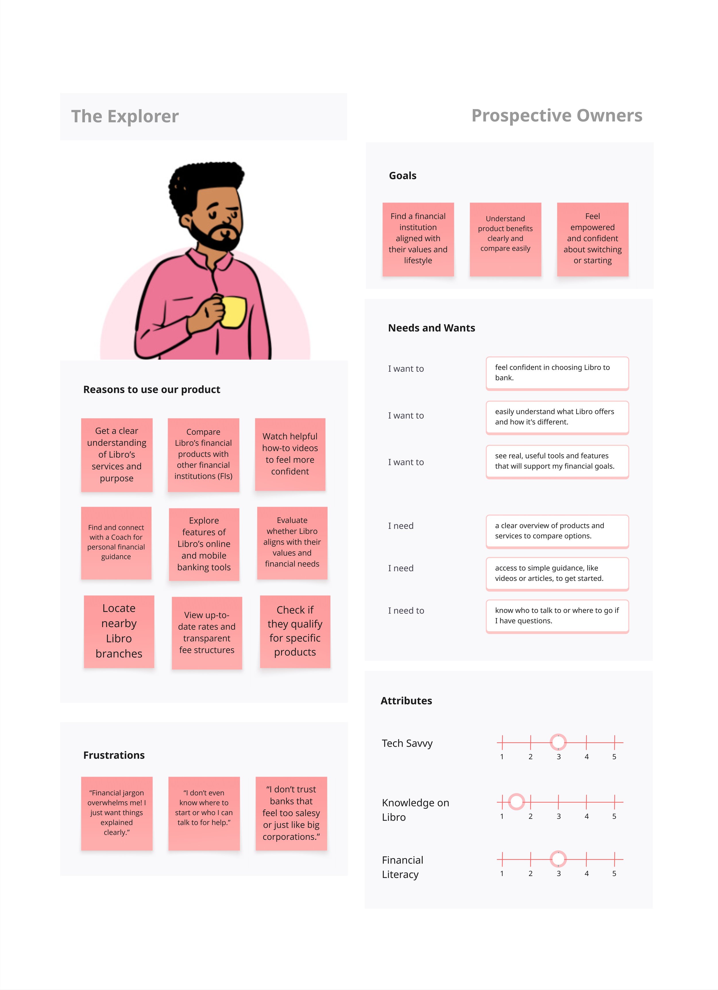
Target Audiences
I thoroughly examined Libro’s website and recognized the need to serve a diverse audience with different motivations, awareness levels, and goals.
From this, we identified three primary audience groups within our target segments:


🔍 User Research Insights
To understand how well the current homepage was meeting user needs, I conducted 20 user interviews across a mix of prospective and current Libro customers.
The insights gathered aligned closely with issues raised during strategic alignment conversations and revealed pain points that directly impacted both user satisfaction and business goals.
💢 Key Pain Points Identified
Mobile navigation

Login button in mobile devices

Page design

Finding help for online banking issues

No useful information on page

Comparing personal and business accounts

Limited emotional connection

Lack of info on community events

Lack of guidance

These pain points signaled that the homepage was not functioning as a helpful gateway for users—especially those unfamiliar with Libro or seeking support in their financial journey. They also emphasized the need for clearer navigation, emotional resonance, and tailored experiences.
Sticky Notes to Solutions
IDEATION
💡 Ideation Sessions
I led a series of drawing ideation sessions to explore solutions for enhancing the homepage experience. The goal was to generate different sections in the low-fidelity sketches that solved user points discovered during research phase.
Below are the sketches, along with a line showing which pain points each designed section addresses.

💢 Finding pages in mobile

💢 Logging to online banking on mobile devices
💢 Page design
💢 Finding help for online banking issues
💢 No useful information on page
💢 Comparing personal and business accounts

💢 Limited emotional connection
💢 Lack of info on community events
💢 Lack of guidance
🔧 Design Iterations: The Wireframing Journey
Over the course of 4 sprints, I facilitated design workshops where our team collaborated to bring ideas to life.
We iterated rapidly to refine solutions and drive alignment.

Visual Progression: Old vs. New
By creating new components, I completely reshaped the website’s structure and visual identity, transforming the user experience from the ground up.

Old Desktop Design

✔️ Trustworthy
✔️ Modern
✔️ Guiding
✔️ Community Involvement
✔️ Trustworthy
✔️ Personalized
✔️ Personal vs. Business
✔️ Informative
✔️ Easy Login
✔️ Good Navigation
New Mobile Design Navigation


Old Mobile Navigation

New Desktop Design

Final Product
If you're having trouble viewing the embedded prototype, use the buttons below to access the high-fidelity Desktop and Mobile versions, along with any portfolio visuals referenced in this case study. You can also visit www.libro.ca to explore the live version of the redesigned website.
Desktop Prototype
🧪 Putting It to the Test
Participants
Prospective or Current Libro customers
Results Summary
Response Count: 218

Overall, user feedback was highly positive. Task completion through the homepage rose to 64%, up from 50% previously. The homepage also saw increases in views, event count, and overall engagement time.
Google Analytics Results Summary

Methods
Measure specific interactions on page, clicks, mis-clicks, journeys to other pages, and capture open-ended feedback.
Qualtric Survey
I built a Qualtrics feedback survey to collect Owner insights on the homepage redesign. The questions were intentionally simple, focused on understanding user actions and beginning to gather Owner behavior data directly through the website.

2
1
Tool Used
Qualtrics, HotJar, and Google Analytics
Fidelity Tested
Live webpage


